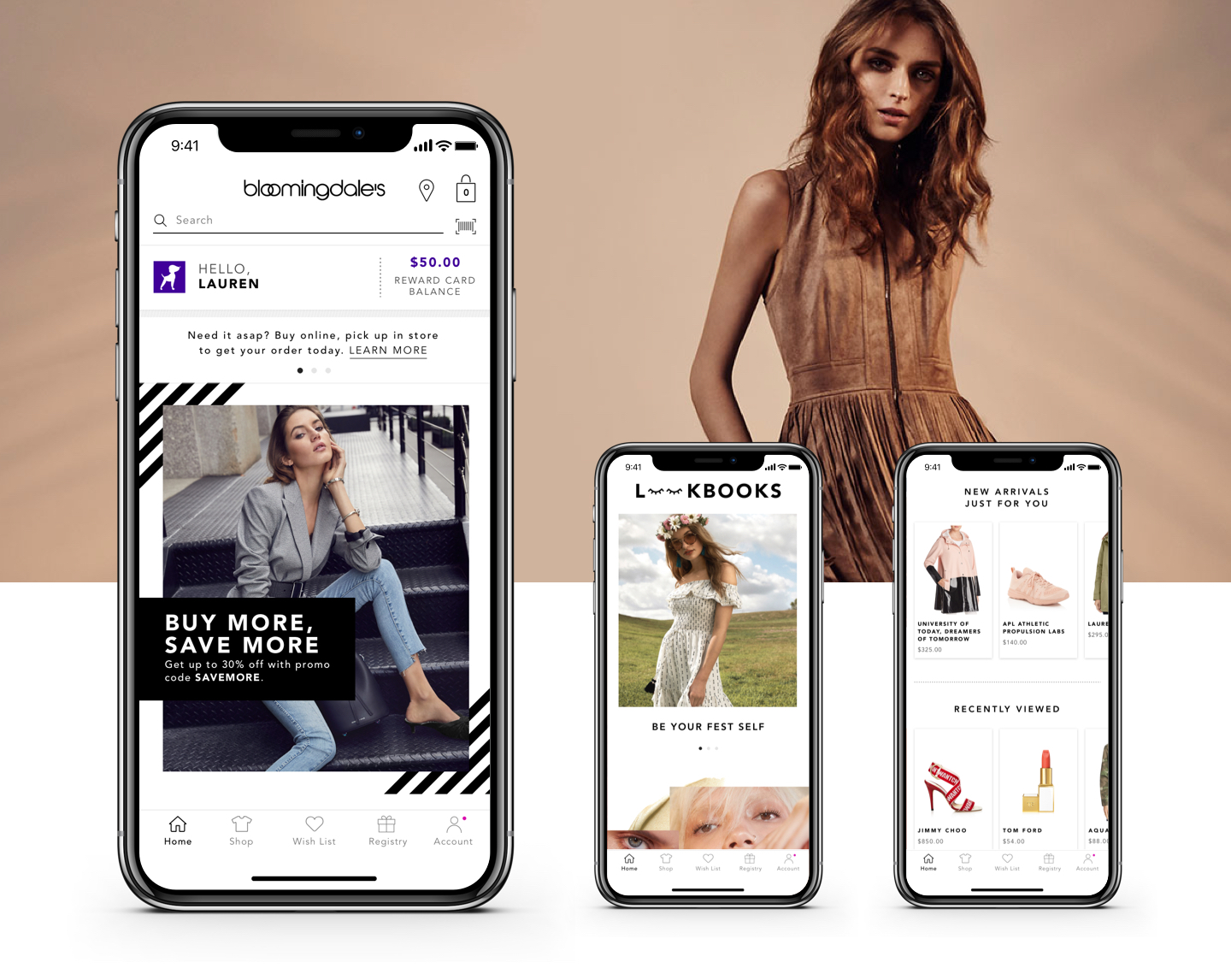
Bloomingdale’s: iOS APp
As a contemporary and ‘of the moment’ brand recognized for it’s originality, innovation and fashion leadership, Bloomingdale’s brings an omnichannel approach focused on providing a seamless customer experience from in-store to online. Just like great style, their app is ever evolving. In order to extend and optimize their existing iOS app strategy, we partnered with them to provide innovation and thought leadership to develop a best in class app with a frictionless and engaging experience to grow and increase daily and monthly usage.
THE LOOK AND FEEL
Bloomingdale’s makes fashion personal and fun, aspirational yet approachable. With that in mind, we created a design direction to help envision the new and refreshed look and feel for the app - a simple and clean aesthetic with subtle pops of color and design flourishes that speaks to the fun and approachable fashion in Bloomingdale’s stores.
NAVIGATION
In order to optimize the mobile app experience, we started with a complete overhaul of their navigation system. The app’s outdated hamburger menu was cluttered and hard-to-navigate and housed everything from shopping categories to credit card information and app settings. Leveraging analytics and research insights provided by Bloomingdale’s, we concepted and tested multiple navigation models with InVision prototypes, which moved key areas of the app into highly visible tab buttons on the bottom of the screen. The results revealed users were open and excited about the proposed model, and felt it was clear, easy-to-access and intuitive. After a few weeks of iterating on the designs, we landed on a bottom navigation leading to Home, Shop, Wishlist, Registry and My Account.
HOMEPAGE
A mobile app is the perfect space for a brand to personally connect with their customers, and the homepage should serve up content specifically for them. Their current homepage simply displayed a swippable promotional banner, and lacked any form of personalization. To remedy this, we created a homepage design that draws customers into the mobile app and keeps them coming back for more personalized engagement and inspiration. Some features of the homepage include easy access to their Loyallist Rewards information, inspirational catalogs and content, and personalized product and brand recommendations based on past purchases and browsing history.
REGISTRY
Because The Registry is one of Bloomingdale’s most successful initiatives, we created an enhanced native registry experience that allows customers to manage their own registries, as well as easily shop for registries as a guest directly from the app.
PRODUCT DETAIL PAGES
In order to increase add to bag and checkout conversion, we provided customers with a cleaner and faster product detail page experience for both single and bundle products, featuring an enlarged image size, reorganized and redesigned hierarchy of product information, fit tools, the ability to write a review, and stock availability.
ACCOUNT & LOYALLIST
While optimizing the shopping experience was key, we also wanted to provide customers with easy access to their account details. We reimagined an engaging new account section which offers an at-a-glance dashboard for highly interactive features like your past orders, saved credit cards, and Loyallist information.
Design System
At the conclusion of our engagement, we created a style library with the components, patterns, interactions, and behaviors that define the Bloomingdale’s iOS app design system and underpins the product's user experience.
“Like No Other Store in the World”
Role: Senior Art Direction/Visual Design Lead at Astound Commerce • Credits: Carissa Lancaster, Nick Pierro • Link: Bloomingdale’s iOS App on iTunes Store


